Top 5 Graphic Design Trends for 2022
We are barely 2 months into 2022 and yet things have already been decided. It is interesting to see where brands are going with their creativity but also the types of new companies that sprout. Covid has caused thousands of businesses to close but on the flip side, also a huge number of start ups have appeared globally. In the UK alone, 400 000 start ups were registered in 2020.
And so, here are what I believe the top 5 trends will be for the year to come.
Character Creation
Standing out from the crowd for being just you [your brand] has never been so important. It follows a trend that has been on the rise for the past 2 years. As people find themselves locked away, a rise in creativity and individualism has skyrocketed. Brands now demand custom visuals and illustrations to help them with their identities.
Here is an example of some such custom graphics that I have worked on.
Carla Watkins - Visual Magic Maker
Carla Watkins is bright, quirky and is a “Visual Magic Maker” . The symbol or animal that depicts her individuality best is the uniquely amazing narwhal. So, I designed this narwhal on paper and painted it using water colour, finally I scanned it in and incorporated her logo. You can see this on her website.
Characters for a kids start-up
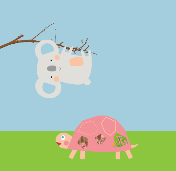
Here are 2 friendly characters I designed for a company that has had a delay but hopefully that will soon come to fruition!
2. Instagram-able Designs
We live in the world of Instagram. If it’s not on the grid, it hasn’t happened or existed, some believe. Influencers and content-creators flock by the millions to Instagram (as well as TikTok, YouTube and Facebook). Food brands, fashion labels, and indeed start ups utilise these free platforms as a form of (free) marketing and reach out directly to their consumers - no middle man. And so, for graphic designers, visually attractive branding, packaging and labels must gain ‘likes’ as much as sales!
Did you know that instagram is the 7th most visited website in the world?
Here’s some packaging I’ve worked on which look striking visually but physically, feel high-end and well-finished.
100% recyclable, low planet-impact packaging for Crossfly, a premium British men’s underwear brand. Go check them out here.
Example of trendy flat lays
Keeping up with trends to show off your products
3. Fonts: Serifs are making a comeback
Fonts play a critical role in design; matching the right font with the right image / graphic can make or break a brand. We all know fonts that depict a brand.
Coca-Cola
The Guardian
McDonald’s
SONY
Adidas
Just to name a few. I don’t need to post the logos as I’m sure you’re already visualising them.
Since 2016(ish) brands big and small have rebranded to follow a trend for sans serif. Google famously rebranded by changing its font. AirBnB was another which caused a huge amount of controversy due to its logo (symbol) looking somewhat like testes…but they trusted it and kept it…maybe they thought that staying ‘in the sack’ was comfortable for all ;)
Fashion brands such as BALMAIN also simplified its logo from what was a classic, unique one previously. Personally, I preferred the earlier version but many brands in 2018 were filling in theirs including British high end brand - Burberry.


The issue with sans serif is that many brands end up looking the same. BALMAIN’s logo and Burberry’s are actually very similar today. Again, I think that the previous one exudes more character so I’m going against the grain.
4. Planet-friendly look
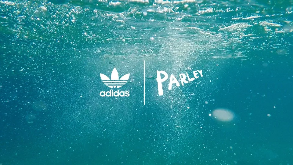
Everyone knows that the planet is under threat; human and waste threat. This has led to some brands creating products that reuse plastic such as Parley from Adidas which has now been in the market since 2015. You can see from the below that its focus is on ocean microplastics which is what the shoes are made of. However, it had been found that the factories ran out of waste microplastic and went to buy plastic to produce the shoes…so don’t believe everything you see in marketing!!
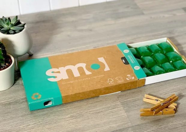
Smol is a company that I use myself and love its simplicity and what it stands for. The branding is simple, just like its products. Everything about Smol is about being a low impact company and it achieves in that.
5. Experimental texts
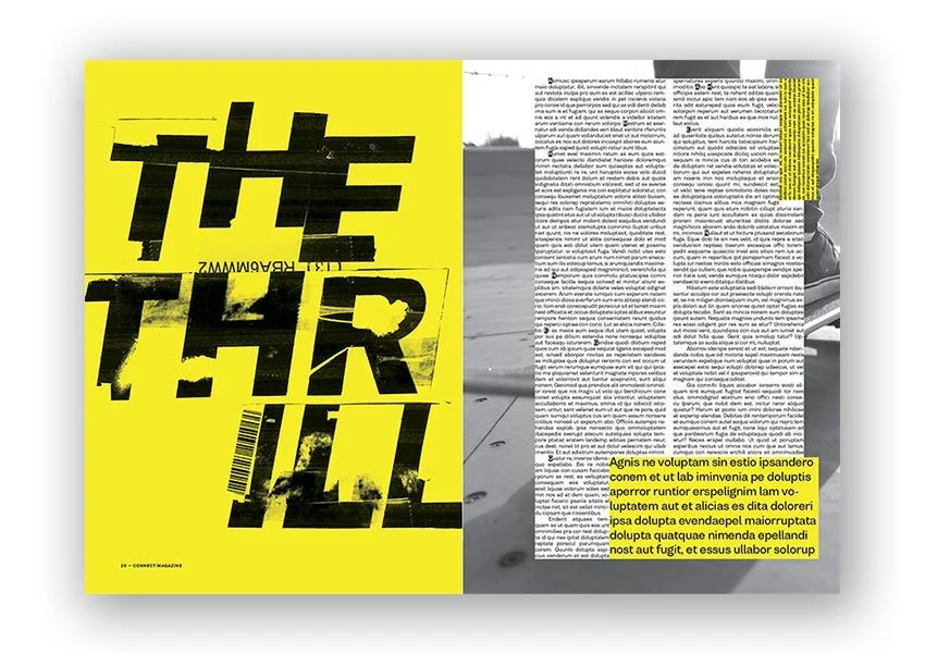
Here are some examples of fonts used within the design. This includes my very own valtsang logo! Here we have a brochure that uses distorted letters which gives some dynamism to the words and to its right, manipulation of the text band is ever so popular. Some even use it to wrap around a product.
So, happy belated new year to you all and here’s a cheer to an excellent 2022! Let the designs begin…
Follow me on instagram


